skin magazine
A Magazine Focusing on Skin Care.
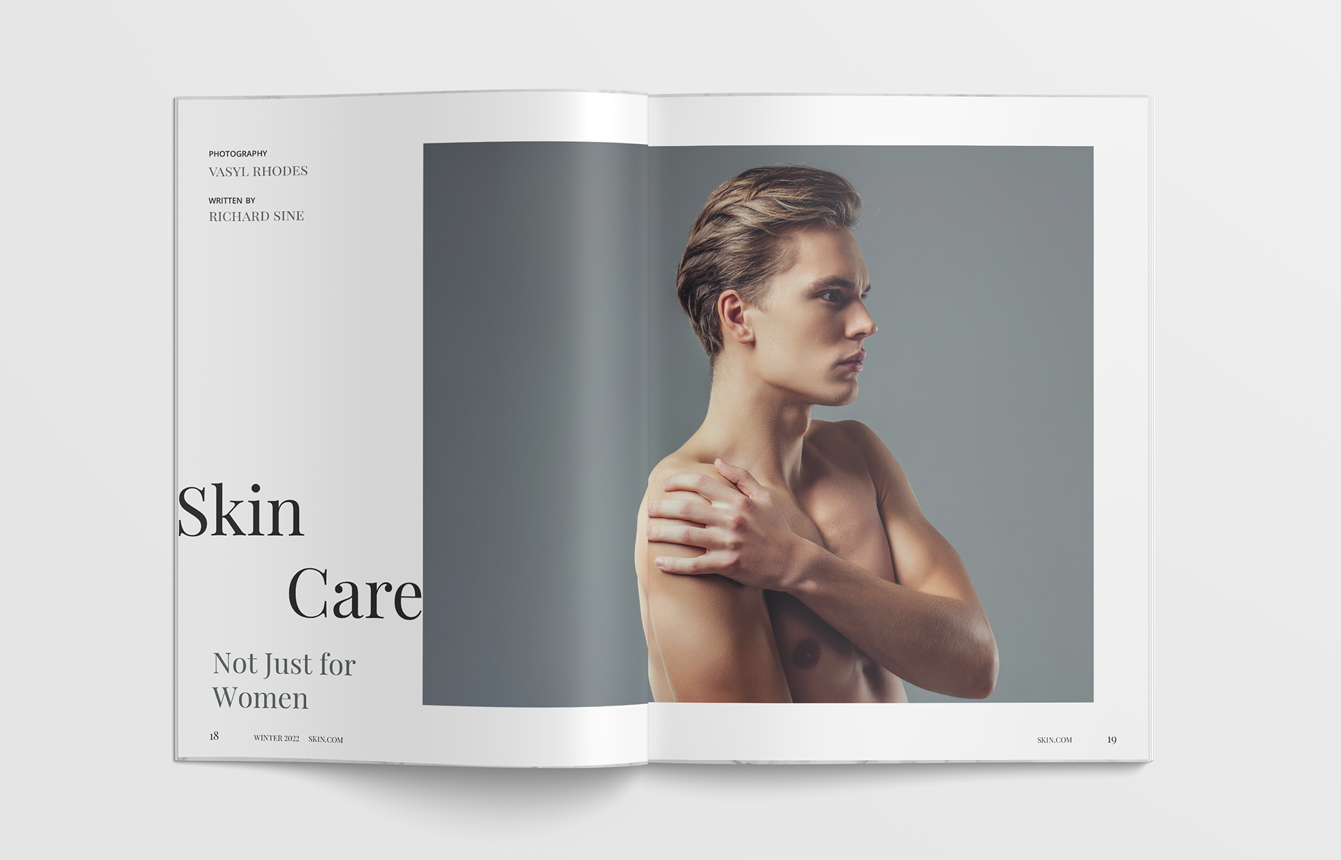
This is the Men's Issue.
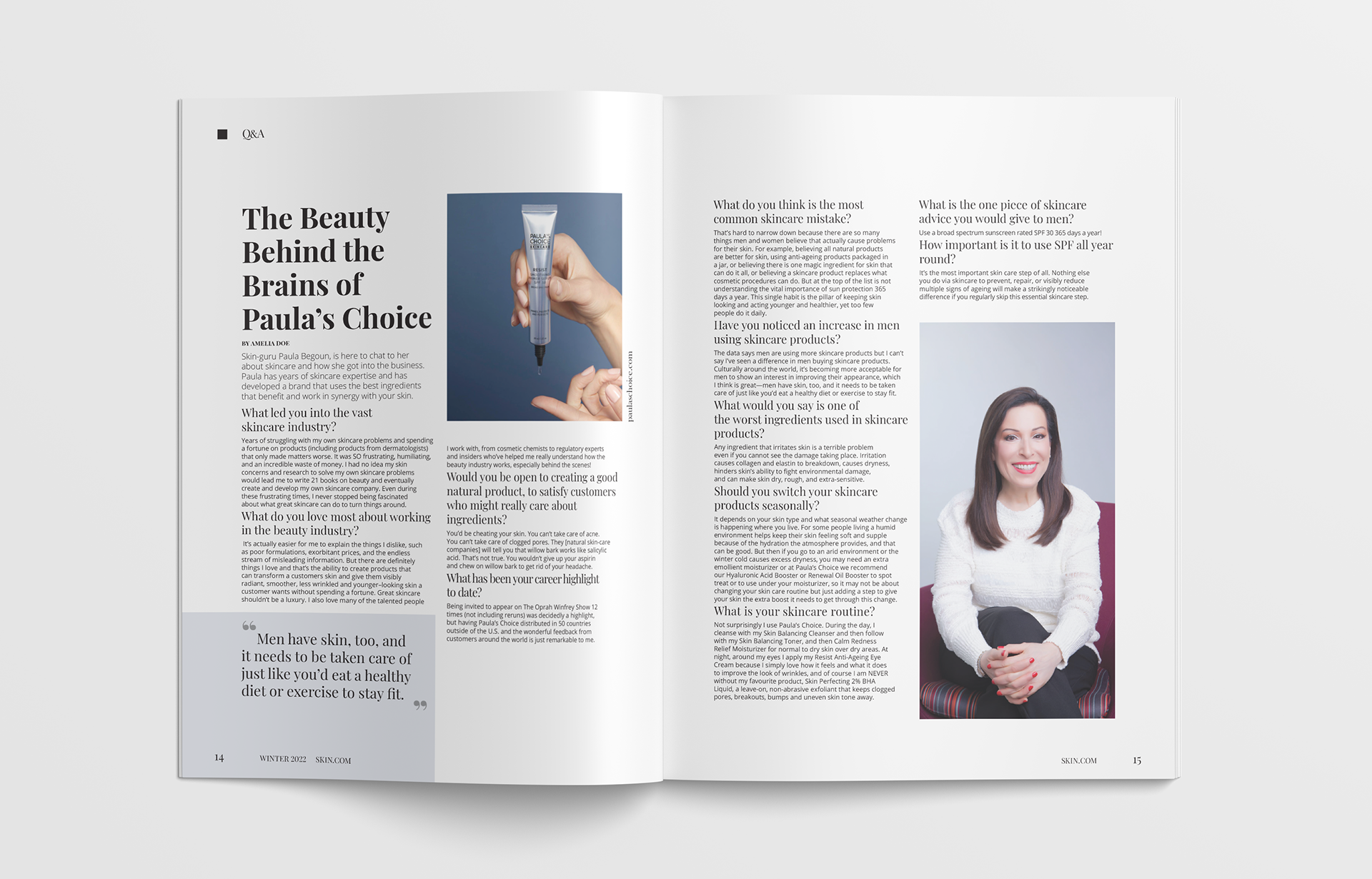
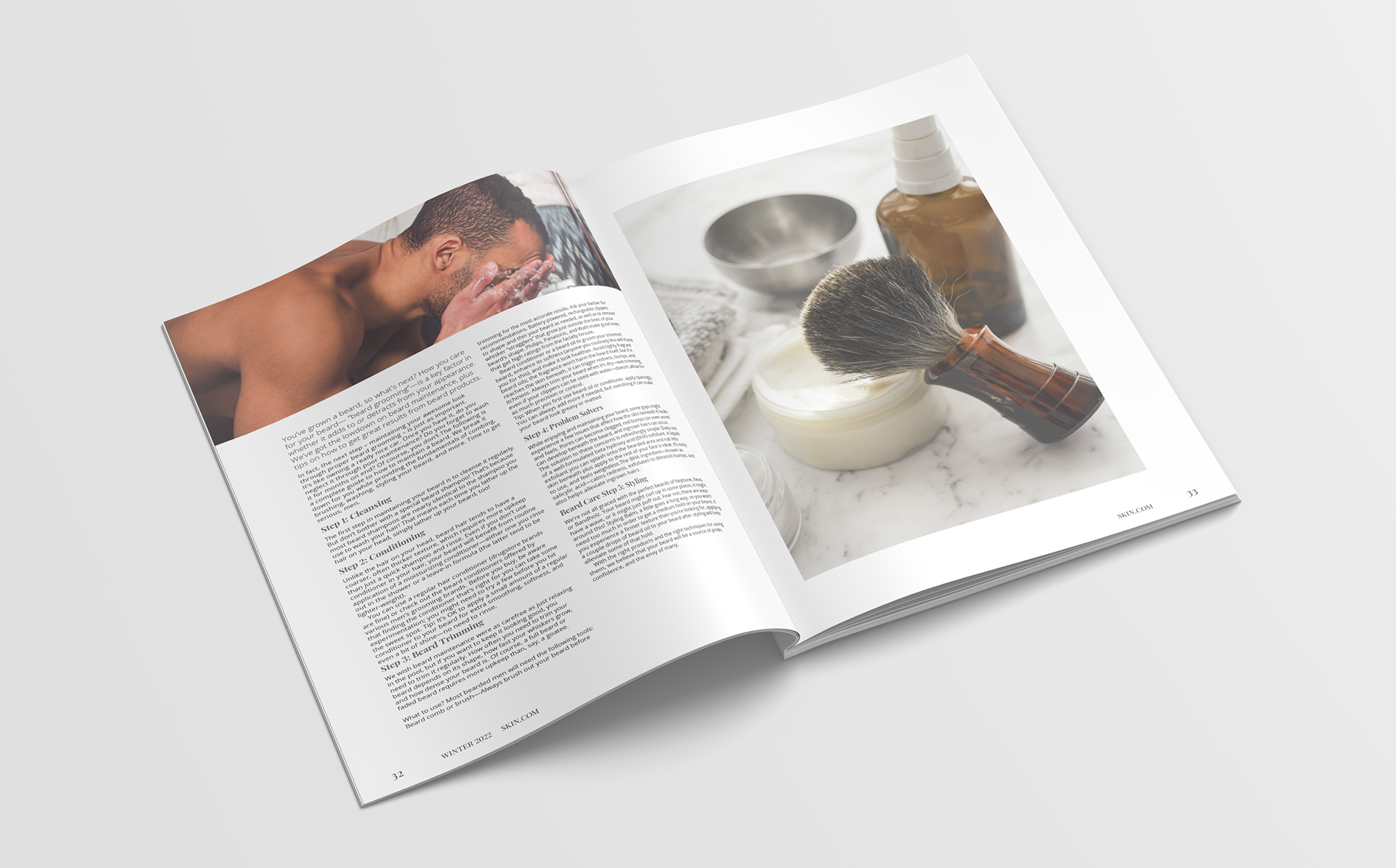
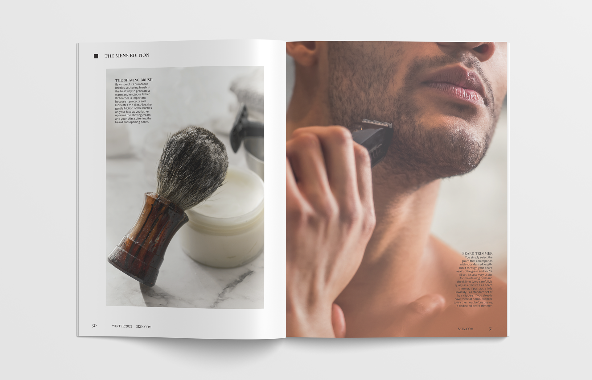
I designed SKIN magazine from the ground up. I aimed to create clean, balanced, visually engaging layouts that appeal to a younger generation. Keeping the overall feel minimalist and modern. With this issue targeted toward men, the overall colour palette is more muted and cool-toned. I opted to blend a serif and sans-serif font to create contrast and enhance the overall feel of the magazine, I aimed to create a sense of credibility and sophistication.


